Search Our Web Design Blog...

Wednesday, February 29, 2012

CSS Layouts

To access the CSS starter layouts, launch Dreamweaver CS5 and choose File > New. In the New Document dialog box that appears, select Blank Page, select HTML from the Page Type list, and then select one of the options in the Layout list (see Figure 1).
Select a layout in the New Document dialog box. Figure 1. Select a layout in the New Document dialog box.
As you click each layout in the list, the right column updates with a description and preview of the selected layout. This is a helpful tool for identifying the page regions included in each layout.
The layouts are grouped in sets by the number of columns they contain. Select a one-column, two-column, or three-column design, and then decide if the site will have a header, footer, and sidebar. If you are working with a mockup or wireframe, compare the page elements with the previews of the CSS starter layouts to identify the best match for your design.

Understanding the difference between fixed and liquid

Layouts are listed as either fixed or liquid. It's important to understand the difference between these two options when picking the ideal layout for your site project.
Liquid layouts are created with div containers that are set to a percentage; if the width is set to 80%, the page will scale to take up that portion of the browser window. (Using the max-width and min-width rules, you can also define the range of the page's widest and most narrow dimensions, in pixels.) In liquid layouts, the width of the page updates as visitors resize the width of their browser window. Liquid layouts are helpful when you want to ensure that a site appears to fit the entire screen, whether the monitor happens to be a 13-inch laptop or a 30-inch flat screen. A potential downside is that you have less control over the layout of sites with a significant amount of text because the text wrapping changes based on the available width of each div container (see Figure 2).
The width of a liquid layout varies, depending on the width of the browser window; the width is not affected by the users' text settings for their browser. Figure 2. The width of a liquid layout varies, depending on the width of the browser window; the width is not affected by the users' text settings for their browser.
Fixed layouts are set to a specific pixel dimension. For example, the width of the outer div container of the layout may be set to a numeric value, such as 960 pixels. Fixed layouts do not change based on the users' text settings or the size of the browser window. If the site is wider than the available width of a low-resolution screen, visitors can scroll to the area of the page that is not immediately visible. Conversely, visitors with large monitors or high screen resolution may see a wide column of the site's background when the browser window is fully expanded (see Figure 3).
The width of a fixed layout remains the same, regardless of the width of the browser window. Figure 3. The width of a fixed layout remains the same, regardless of the width of the browser window.
The CSS starter layouts are completely customizable — you are not limited to using the preset widths of the outer div container. You can use the CSS Styles panel to edit the .container style to reset the width of the page.
Generally speaking, the most common convention used in sites is a fixed layout that uses the margin: 0 auto; style to center the outer div container on the page. The best way to see how the layouts will display is to test them:
  1. Choose File > New and select one of the CSS starter layouts.
  2. Save the page and choose File > Preview In Browser.
  3. Drag one of the bottom corners of the browser window to resize it.
  4. Notice how the page width updates (or doesn't update) as the window width changes.

For today, choose a layout, "save as" three + times, and start adding content.  We will learn more about changing colors & styles in the near future.


Site specs:
  • DW layout
  • 3+ pages
  • Banners created in PhotoShop
  • Buttons/text created in PhotoShop
  • content on each page
  • image(s) on each page

Define a Site

Define a local site folder

You must define a Dreamweaver local site folder for each new website you create. Dreamweaver needs to know where your site files are to create all the internal links correctly, and to update them when you move files to a different location within your site.
Next, set up the site for this tutorial series and define as your local site folder the check_cs5 folder you copied into your Sites folder:
  1. Start Dreamweaver and select Site > New Site. The Site Setup dialog box appears.
  2. In the Site Name text box, enter Your Site Name as the name of the site. The name is used internally by Dreamweaver to identify the site. It doesn't matter if it contains spaces.
  3. Click the folder icon next to the Local Site Folder text box to browse to and select the check_cs5 folder. The Site Setup dialog box should now look like Figure 1.
Defining the local site folder for the Check Magazine site.

Monday, February 27, 2012

Wednesday, February 15, 2012

more in PhotoShop

We will use Photoshop a lot over the term to build buttons, banners, and graphics.

Today we will get a start on that.  Please find 3 text tutorials you like, and follow them as best you can.  You goal is to create some text that you think will be interesting, unique, and could look good on a future web project of yours!


Tutorials here

Wed Design 2

This Photoshop tutorial shows you how to create a simple and clean "Web 2.0 style" button sprite with a rollover state. You’ll also learn how to set up the sprite using some basic CSS techniques (CSS background sprite and CSS text image replacement).

Working with Photoshop


01 Photoshop: Create Web 2.0 Button
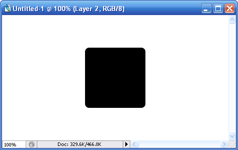
Create a blank canvas at about 500px (width) x 400px (height) to start off the button design. Create a new layer call ‘bg01‘. Select the Rounded Rectangular Tool, hold SHIFT and draw a round sided square in the center. Any color is fine at the current stage.
02 Photoshop: Create Web 2.0 Button
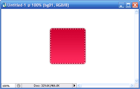
Call up the Blending Options of ‘bg01‘ and adjust the following styles:
Drop Shadow
  • Opacity: 40%
  • Distance: 0px
  • Spread: 0%
  • Size: 6px
Gradiant Overlay
  • Color stop: 0%, #d00031
  • Color stop: 100%, #ff2b5d
03 Photoshop: Create Web 2.0 Button
Hold CTRL, left click on ‘bg01‘ Layer Thumbnail to select its shape. Go Select -> Modify -> Contract and enter the value ‘2px‘. This will shrink the selected area by 2 pixel.
04 Photoshop: Create Web 2.0 Button
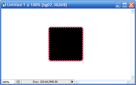
Create a new layer call ‘bg02‘ and filled the highlighted (after shrink) area with any color. I use #000000 black here. Double click on ‘bg02′ to launch up the Blending Option and tweak the following style.
Gradiant Overlay
  • Color stop: 0%, #c6002f
  • Color stop: 100%, #c6002f
Create another new layer for text, call it ‘txt‘. Insert your button’s text. I’ll use an alphabet to represent. The font styles I’m using here are as follow:
  • Rounded Arial Bold
  • 150pt
Same, after deciding your text, double click on ‘txt’ to launch the Blending Options and tweak the following styles.
Drop Shadow
  • Opacity: 25%
  • Distance: 0px
  • Spread: 0px
  • Size: 5px
Inner Shadow
  • Opacity: 10%
  • Distance: 0px
  • Choke: 0
  • Size: 10px
Bevel Emboss
  • Depth: 1px
  • Direction: Down
  • Size: 0px
  • Softten: 0px
  • Highlight Mode Opacity: 32%
  • Shadow Mode Opacity: 32%
Gradiant Overlay
  • Color Stop:0% #d2d2d2
  • Color Stop:100% #f0efef
05 Photoshop: Create Web 2.0 Button
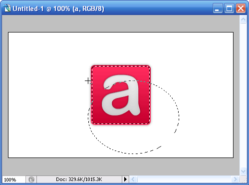
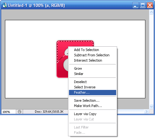
Button is almost done. Let’s give it a little glow over the top part. Hold CTRL, left click ‘bg02‘ Layer Thumbnail to highlight the outer shape; choose Eclipse Marquee Tool. Now hold ALT, with Eclipse Marquee Tool selected, drag is across to minus out bottom half of the highlighted area. Refer to image above.
06 Photoshop: Create Web 2.0 Button
With the top portion highlighted and Eclipse Marquee Tool still selected, right click and choose Feather; enter 15px for the radius.
Create a new layer, call it ‘glow‘ and fill the highlighted part with white [#ffffff]. This should add glow effect to the top part of your button. Final product should look something like the image below.
final Photoshop: Create Web 2.0 Button

Thursday, February 9, 2012

catch up

in case you missed/forgot some info on basic HTML here is a great resource:

http://www.htmlgoodies.com/primers/html/article.php/3478151

Wednesday, February 8, 2012


tables

For your html site you will need to make a navigation bar out of a table:


http://www.mountaindragon.com/html/tables2.htm


You will also need the code to make a link:


here is the code form my example table which has 3 columns, 1 row, and 3 links to my pages:


Forgetting to Close a Tag

This is very common, especially in beginners. Several tags require closing tags such as divs, strong tags, and links to name a few. Other tags require a closing slash to end the line such as an img tag.
Text inside the div.

Improperly nesting tags

It’s very important to open and close tags in the proper order. Once something (for example a div) has opened, it must close before anything above it can close. The following is incorrect.


Capitalizing tags

This is just considered bad practice, but won’t result in your code not being validated. You should always use lowercase for tags like divs, links, and images. The following is incorrect.


Forgetting to open or close quotes

I’ve seen this a lot in beginners and will result in broken code and things not functioning properly. HTML requires double quotes that open and close correctly. Here’s an example of correct usage.


tables

http://www.mountaindragon.com/html/tables2.htm
File Management:
  • No Spaces in File Names
  • No UPPER case letters
  • Stick with .html for file names
  • All files must live in your "Root" folder (name it something simple & logical)
  • back up everything (have a second copy, we will learn how to do this Friday)
  •  
     

Our First Adventure in HTML

 Requirements for your site (topic is you - your hobbies, interests, activities, friends, family etc.)
  • 3+ pages
  • linking nav table (will learn this on Friday)
  • 1+ image per page
  • 1+ paragraph of info written by you per page
  • colors
  • text/fonts
  • fun!