Monday, June 18, 2012
Web Critique
- How does the site look? good/bad? appropriate for topic?
- Everything working?
- What could be improved?
- What would you change if it were your site?
Monday, June 11, 2012
Final Reminder
- 6+ pages(4 for seniors)
- Professional Layout
- Consistent Navigation
- Client/Visitor appropriate colors, theme, images etc.
- Use software of your choice to the best of your ability
- Compare your site to another of a similar topic/theme, how does yours stack up? Our goal is for yours to be equally as impressive, professional, and functional.
- It is often best to incorporate a variety of programs, styles, and techniques. A well organized site may have a Flash element, Photoshop images/buttons, HTML layout tables/cells, and/or CSS all in one!!!! Don't pigeon hole yourself into one style of design/code.
You need to design a site, using the program(s) of your choice on a (classroom appropriate) topic of your choice.
Friday, June 1, 2012
Thursday, May 31, 2012
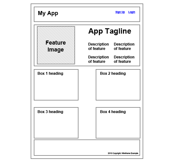
Wireframes
Today you need to create a layout sketch to turn in for your final site. You should make a thumbnail sketch of each page.... here are some tips:
http://creativebits.org/toolbox/5_unusual_ways_create_website_mockups

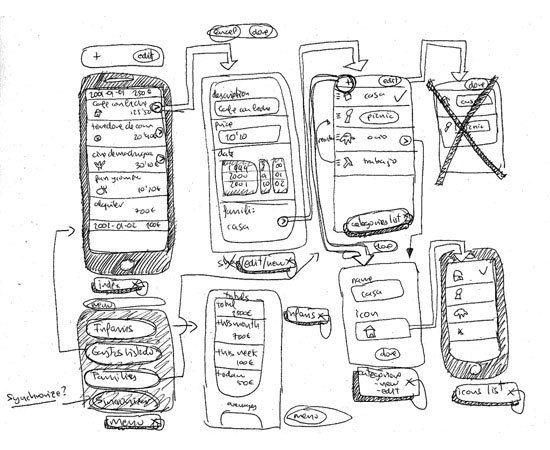 Rough sketch of user interface flow on a mobile app. Image by Fernando Guillen.
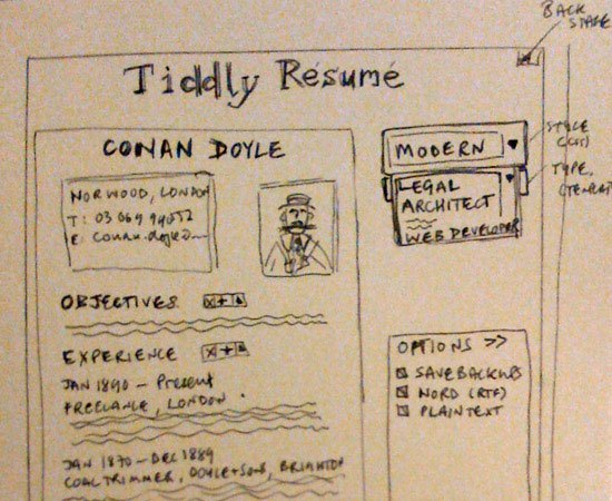 An example of a low-fi wireframe for a web app. Image by Paul Downey.

http://creativebits.org/toolbox/5_unusual_ways_create_website_mockups
Most designers wireframe their designs in one way or another, even if it just involves them making quick sketches on the back of some scratch paper. Wireframing is an important part of the design process, especially for more complex projects.
Wireframes can come in handy when you’re communicating with clients, as it allows them to visualize your ideas more easily than when you just describe them verbally.
This guide covers what you need to know about website wireframes to get started.
Why You Should Wireframe Your Web Designs
Wireframing is really the first step in the design process. Unless the site you’re designing is incredibly minimal and simple, wireframing helps clarify exactly what needs to be on the different page types of your website.
By taking the time to create at least a simple wireframe, you can make sure that your designs will take into account all the different page elements that need to go into the design, and that they’re positioned in the best possible way.
Wireframes are also cost-effective by saving you potential time lost due to revising a high-fidelity comp. Wireframes can easily be revised or discarded.
Wireframes give your page layouts a great starting point and a solid foundation.
Wireframe vs. Mockup vs. Prototype
Wireframes, mockups, and prototypes are sometimes used interchangeably, but they are three different things (though there is sometimes some overlap between them). Each one has a slightly different purpose that it gives to the design process.
Wireframes are basic illustrations of the structure and components of a web page. This is generally the first step in the design process.
Mockups generally focus on the visual design elements of the site. These are often very close or identical to the actual final site design and include all the graphics, typography, and other page elements. Mockups are generally just image files.
Prototypes are semi-functional webpage layouts of a mockup/comp that serves to give a higher-fidelity preview of the actual site being built. Prototypes will have the user interface and is usually constructed using HTML/CSS (and even JavaScript for showcasing how the front-end interface works). This stage precedes programming the business logic of the site. While they might not have full functionality, they generally give clients the ability to click around and simulate the way the site will eventually work. Prototypes may or may not also include finalized design elements.
Rough sketch of user interface flow on a mobile app. Image by Fernando Guillen.
Wireframes come first. What follows — either prototypes or mock up models — is largely going to be dependent on the type of site you are building. If it’s a web app rather than a simple static website, it’s likely going to benefit from prototyping.
How to Create a Wireframe
Creating a wireframe can be as simple or as complicated as you want. In its most basic form, your wireframe might be nothing more than a sketch on some graph paper. Other "wireframes" are created digitally and are really more like prototypes, with clickable objects and limited functionality.
The type of wireframe you create will depend on what the individual project requires, as well as what your own workflow is like. More complicated projects will likely have more complicated wireframes, while simple sites might have simpler wireframes.
What to Include in a Wireframe
Your wireframes should include enough information to reflect what needs to appear on each page of your website. Think about the general elements of most web pages:headers, footers, sidebars, and content areas.
Then think of additional elements your specific project will have: dynamic widgets, basic site features such as search bars and navigation, graphics, and so forth.
Once you have an idea of what your site will include, start creating your wireframes based on those elements.
How detailed you want to get will again depend on the project and the purpose of the wireframe. If your wireframe is just going to serve as a guiding document for your own reference, then you don’t want to get too involved in the wireframing process. On the other hand, if it’s going to be used by more than one designer or developer, or presented to your client, then it needs to be more formal.
Low-Fidelity vs. High-Fidelity Wireframes
You have a couple of options when it comes to the style of your wireframes. Some designers opt for low-fidelity (low-fi) wireframes that are basically just lines on a plain background with some labels. These include both hand-drawn and digital wireframes, and they’re usually very simple.
An example of a low-fi wireframe for a web app. Image by Paul Downey.
High-fidelity (hi-fi) wireframes go one step further, using certain design elements within the wireframe. This might include the logo or some other basic graphics, as well as the color scheme and other visual design elements.
Wireframes like this start approaching the level of mockups, but they can be invaluable in conveying a sense of what the website will look like, especially to clients who might have a hard time visualizing what a website will look like based on a low-fi wireframe.
Wireframing Techniques
There are dozens of different ways to create wireframes, ranging from simple, pen-and-paper sketches to more complex diagrams that look almost as polished as production websites.
There are also different approaches to the purpose and reasoning behind creating wireframes, depending on the needs of individual designers and projects. Here are some resources about different procedures for creating website wireframes.
UXmatters has a great article on how to wireframe using Adobe InDesign and Illustrator. They talk about what led the to the decision to use InDesign and Illustrator over other products, as well as how they go about using these two applications to create their wireframes.
Jason Santa Maria has a fantastic post about the "Grey Box Method" of creating wireframes. He outlines his entire process for creating wireframes, from sketching on paper to creating a grayscale wireframe in Illustrator. He includes examples from a couple of different sites to illustrate his points.
Wednesday, May 30, 2012
LilCMS
First
click here to download Lil' CMS. It's only
2 kb :) All that you'll find inside the archive are lilcms.php (CMS itself) and
readme file. If you want to take a look at the code right now, here
it is.
This is version 1.1 with "slashes bug" fixed (if you tried v1.0 you know what it is). There aren't any bugs any more, as far as we know.
This is version 1.1 with "slashes bug" fixed (if you tried v1.0 you know what it is). There aren't any bugs any more, as far as we know.
Before everything, you need to know that pages
with editable text need to be either PHP or SHTML. As for PHP any version
would do and as for SHTML (extension that implicates that your web page uses server
side includes), what you'll do is really basic and should work with literally
any web host.
We recommend you first try with PHP extension.
There're many handy php snippets around and you may want to use them with your
site later -- in that case you will not need to change anything. In both cases
(php or shtml) you will not need to insert any special code in order for them
to work - any html page will work just fine if you rename it to .php or .shtml,
these extensions are only notice for web server that maybe some dynamic code is
inside too.
On to the installation! First create the following
folders in the root (that's where your html/php/etc pages are) of your web site:
backup
content
cms
content
cms
Now
open TextEdit and create text documents with content that will be editable.
For example:
introduction.txt
news.txt
footer_text.txt
news.txt
footer_text.txt
Put
them all in the content folder. Set their file permissions to 777 (this is very
easy, every FTP client features Change Attributes command).
Set 777 to backup folder too.
Upload lilcms.php to folder cms. You can change
its filename to whatever you like. You can change folder's name to whatever you
like. It's completely ok if you access Lil' CMS through address such as www.somesite.com/cms9403KLC402/siteedit.php
You
can also change location of text files if you like, just edit lilcms.php, it's
right there in the second line:
$CPATH="../content/";
You may change word "content" to whatever you like.
$CPATH="../content/";
You may change word "content" to whatever you like.
We're
almost there. Now go to locations of the web page(s) where you want editable text
and insert the following piece of code:
If you renamed your
web pages to SHTML:
If you renamed your web pages to PHP:
... and of course
rename somefile.txt to introduction.txt or news.txt or whatever you came up with.
That'd
be all! Now let's see how to use it.
Go
to location of the cms, for example www.mysite.com/cms/lilcms.php
You'll
get a window like this:

In
the left column click on the file that you want to edit, then click on button
Load. The file will open in the edit window on the right:
Before
you edit a file it's wise to make a backup. Click on the button Backup
and backup file will be created in the backup directory.
When
you're done with editing, click on the button Update.
If you did something wrong, and if you backed up a file, click on the button Restore to revert the latest version.
That'd be all! :)
If you did something wrong, and if you backed up a file, click on the button Restore to revert the latest version.
Web 2 CMS
First
click here to download Lil' CMS. It's only
2 kb :) All that you'll find inside the archive are lilcms.php (CMS itself) and
readme file. If you want to take a look at the code right now, here
it is.
This is version 1.1 with "slashes bug" fixed (if you tried v1.0 you know what it is). There aren't any bugs any more, as far as we know.
This is version 1.1 with "slashes bug" fixed (if you tried v1.0 you know what it is). There aren't any bugs any more, as far as we know.
Before everything, you need to know that pages
with editable text need to be either PHP or SHTML. As for PHP any version
would do and as for SHTML (extension that implicates that your web page uses server
side includes), what you'll do is really basic and should work with literally
any web host.
We recommend you first try with PHP extension.
There're many handy php snippets around and you may want to use them with your
site later -- in that case you will not need to change anything. In both cases
(php or shtml) you will not need to insert any special code in order for them
to work - any html page will work just fine if you rename it to .php or .shtml,
these extensions are only notice for web server that maybe some dynamic code is
inside too.
On to the installation! First create the following
folders in the root (that's where your html/php/etc pages are) of your web site:
backup
content
cms
content
cms
Now
open Notepad (or such ;) and create text documents with content that will be editable.
For example:
introduction.txt
news.txt
footer_text.txt
news.txt
footer_text.txt
Put
them all in the content folder. Set their file permissions to 777 (this is very
easy, every FTP client features Change Attributes command).
Set 777 to backup folder too.
Set 777 to backup folder too.
Upload lilcms.php to folder cms. You can change
its filename to whatever you like. You can change folder's name to whatever you
like. It's completely ok if you access Lil' CMS through address such as www.somesite.com/cms9403KLC402/siteedit.php
You
can also change location of text files if you like, just edit lilcms.php, it's
right there in the second line:
$CPATH="../content/";
You may change word "content" to whatever you like.
$CPATH="../content/";
You may change word "content" to whatever you like.
We're
almost there. Now go to locations of the web page(s) where you want editable text
and insert the following piece of code:
If you renamed your
web pages to SHTML:
If you renamed your web pages to PHP:
... and of course
rename somefile.txt to introduction.txt or news.txt or whatever you came up with.
That'd
be all! Now let's see how to use it.
Go
to location of the cms, for example www.mysite.com/cms/lilcms.php
You'll
get a window like this:
In
the left column click on the file that you want to edit, then click on button
Load. The file will open in the edit window on the right:
Before
you edit a file it's wise to make a backup. Click on the button Backup
and backup file will be created in the backup directory.
When
you're done with editing, click on the button Update.
If you did something wrong, and if you backed up a file, click on the button Restore to revert the latest version.
That'd be all! :)
If you did something wrong, and if you backed up a file, click on the button Restore to revert the latest version.
Web 1 $& 2 Final Site
specifics:
You need to design a site, using the program(s) of your choice on a (classroom appropriate) topic of your choice.

Web Design 2, your final is the same in concept, though in practicality there will be a difference. The main content of each page needs to be editable using a Content Management System. This means that the text of the main body of each page will actually be written in a TextEdit document that we will then be able to alter using LilCMS.
More info to come...
- 6+ pages(4 for seniors)
- Professional Layout
- Consistent Navigation
- Client/Visitor appropriate colors, theme, images etc.
- Use software of your choice to the best of your ability
- Compare your site to another of a similar topic/theme, how does yours stack up? Our goal is for yours to be equally as impressive, professional, and functional.
- It is often best to incorporate a variety of programs, styles, and techniques. A well organized site may have a Flash element, Photoshop images/buttons, HTML layout tables/cells, and/or CSS all in one!!!! Don't pigeon hole yourself into one style of design/code.
You need to design a site, using the program(s) of your choice on a (classroom appropriate) topic of your choice.
- To get started please answer the 8 questions here
- Next you need to create a layout sketch or wireframe for each page in your site.You can do this by hand or using Illustrator or ????
- your topic,
- the program(s) you are going to use,
- what your pages will be about,
- and what the layout will look like for each page
Web Design 2, your final is the same in concept, though in practicality there will be a difference. The main content of each page needs to be editable using a Content Management System. This means that the text of the main body of each page will actually be written in a TextEdit document that we will then be able to alter using LilCMS.
More info to come...
A customized cursor
To make a custom cursor follow these steps:
 The code (based on a movie clip named MyCursorClass with a Linkage set to MyCursorClass:
import flash.display.Sprite;
import flash.display.StageAlign;
import flash.display.StageScaleMode;
import flash.events.Event;
import flash.events.MouseEvent;
var myCursor:Sprite;
stage.align = StageAlign.TOP_LEFT;
stage.scaleMode = StageScaleMode.NO_SCALE;
function init()
{
Mouse.hide();
// this creates an instance of the library MovieClip with the
// name, "MyCursorClass". this contains your mouse cursor art
//
myCursor = new MyCursorClass();
myCursor.mouseEnabled = false;
myCursor.visible = false;
// you'll want to make sure the child is added above everything
// else, possibly in its own container
//
addChild(myCursor);
// respond to mouse move events
stage.addEventListener(MouseEvent.MOUSE_MOVE, mouseMoveHandler);
stage.addEventListener(Event.MOUSE_LEAVE, mouseLeaveHandler);
}
function mouseMoveHandler(evt:MouseEvent):void
{
// whenever the mouse moves, place the cursor in the same spot
myCursor.visible = true;
myCursor.x = evt.stageX;
myCursor.y = evt.stageY;
}
function mouseLeaveHandler(evt:Event):void
{
myCursor.visible = false;
}
init();
Kind of confusing I know... so here is an easier but less cool way to do the same thing:
if you do not need your cursor to be very precise:
name your instance name for your new cursor movieclip "cursor"
then add this code to frame 1 of your main timeline:
Mouse.hide();
stage.addEventListener(MouseEvent.MOUSE_MOVE,follow);
function follow(evt:MouseEvent){
 cursor.x = mouseX;
 cursor.y = mouseY;
}
Now all you need to do is double click on your movie clip and
move the object to align with the crosshair (this is the registration
point for your cursor).
Intro Movie
A few people have had issues with their intro movie button (enter/skip). Here is the scoop for all things intro movie:
You will need to make a new scene to act as an introduction.
same code as other buttons but change the navigation to:
gotoAndPlay(frame #, "Scene Name");
frame # = the first frame of your number of your next scene "1" (typed out just as 1)
Scene Name = the name of your web site scene in the scene window (windows > other panels > scene). This MUST be in quotes""
You will need to make a new scene to act as an introduction.
- 200+ frames
- skip intro option to enter site
- related to topic
- entertaining
- professional
same code as other buttons but change the navigation to:
gotoAndPlay(frame #, "Scene Name");
frame # = the first frame of your number of your next scene "1" (typed out just as 1)
Scene Name = the name of your web site scene in the scene window (windows > other panels > scene). This MUST be in quotes""
Thursday, May 24, 2012
Publish your site
To do so you need to follow a couple steps:
File > publish settings > set up to publish HTML and SWF
Choose a new folder on your desktop to publish these two files to, this is the folder you will turn in!

File > publish settings > set up to publish HTML and SWF
Choose a new folder on your desktop to publish these two files to, this is the folder you will turn in!

Monday, May 21, 2012
Preloader
For Extra Credit you can add the following to your movie:
PRELOADER!!!
for a more in depth preloader click here
We are going to make our loading movie on a new scene

PRELOADER!!!
for a more in depth preloader click here
We are going to make our loading movie on a new scene
We are going to start off with our preloader first, this frame is only going to have the text "Loading" and it will remain there until the website finishes loading. To do this, click once on the layer labeled Content then pick the Text Tool and write something in the middle of the stage. Make this a movie clip with an animation that will loop while your movie loads.
We are now going to write the code for the preloader, click once on the Actionslayer and then right-click it and select Actions to open up the Actions panel. Paste the code below to program the preloader.
stop();
this.addEventListener(Event.ENTER_FRAME, loading);
function loading(e:Event):void {
var total:Number = this.stage.loaderInfo.bytesTotal;
var loaded:Number = this.stage.loaderInfo.bytesLoaded;
if (total == loaded) {
play();
this.removeEventListener(Event.ENTER_FRAME, loading);
}
}
this.addEventListener(Event.ENTER_FRAME, loading);
function loading(e:Event):void {
var total:Number = this.stage.loaderInfo.bytesTotal;
var loaded:Number = this.stage.loaderInfo.bytesLoaded;
if (total == loaded) {
play();
this.removeEventListener(Event.ENTER_FRAME, loading);
}
}
This code is explained at AS3 Flash Preloader Tutorial. Please review that tutorial to learn about how this code works.
That completes our preloader part, close the Action panel once you are done to go back to your movie. We are going to start now working on the rest of the website. We will start off now by adding the background. You can use our background here to follow the tutorial. Simply right-click this image and selectCopy, we are going to paste it in Flash later.
Wednesday, May 9, 2012
site requirements
- 3+ pages
- transitions between pages
- 200 frame intro movie
- content on each page
- looping movie clip on each page (related to your product)
- extra credit: preloader
Let's make your buttons link
To link your buttons you need to add some more code (different for EACH of your buttons). You will also need stop commands at the end of your "pages"
:
:
yourButtonsInstanceName.addEventListener(MouseEvent.CLICK, onClick);
function onClick(event:MouseEvent):void{
gotoAndPlay("Your Frame Label Here");
}Thursday, May 3, 2012
Due today
Turn in your menu (of whatever you have) today.
File > Export > .swf flash movie
Turn this into the classes folder.
Your menu ideally should have at least 3 functioning animated flash buttons with "over" and "out" transitions for each button.
Please turn in your movie/menu regardless if it is complete or not!
File > Export > .swf flash movie
Turn this into the classes folder.
Your menu ideally should have at least 3 functioning animated flash buttons with "over" and "out" transitions for each button.
Please turn in your movie/menu regardless if it is complete or not!
Wednesday, May 2, 2012
Adding Pages to your movie/site

Each "page" of your site needs to have a layer as well as a chunk of your timeline. See above example

this is the timeline of your MOVIECLIP, it has its own timeline, this is how it should look:

Flash Site Specifics
Below is a list of specifics for your Flash sites. These sites MUST be interactive, entertaining, and promoting/advertising a product/brand/event.
- 1024x768
- 3+ flash buttons/pages to your site
- buttons must be movie clips with rollover events
- 3+ pages must contain content
- each page must contain an animated movie clip which loops throughout the page/time
- transitions between pages (a simple tween to play after click)
- a background that is appropriate to your site/product
- a heading/title for each page
- published as .html file
Thursday, April 19, 2012
Flash Buttons
creating
a menu and then a website in flash is fun, although a hair
confusing... here is a link to a tutorial of what we will be doing in
class:
buttons:
http://schoolofflash.com/blog/2008/05/flash-cs3-tutorial-movie-clip-buttons/start with buttons (they are animated! fun!) then we can add them to a website, which is fairly simple...
Taylor (TA) is a Flash guru and is ready to answer questiona
Flash is an animation program that can prove useful for the web, most notably for it entertainment properties. It works with a timeline, layers and scenes to create basic animations...
Action scripting: the code used to make your button work!
YOUR INSTANCE BUTTON NAME.buttonMode = true;
YOUR INSTANCE BUTTON NAME.addEventListener(MouseEvent.ROLL_OVER,animIn);
YOUR INSTANCE BUTTON NAME.addEventListener(MouseEvent.ROLL_OUT,animOut);
function animIn(event:MouseEvent):void {
event.target.gotoAndPlay("over");
}
function animOut(event:MouseEvent):void{
event.target.gotoAndPlay("out");
}
Wednesday, April 18, 2012
- make a new layer for buttons
- draw an object/shape
- select that shape
- convert it to a button (modify > convert to symbol > button
- Change the instance name of your button (in the properties window) to something you can remember
- Create an actions layer
- on frame 1 of the actions layer paste in the code below (you will need to open the actions window to do so, window>actions)
- change the code to have your instance name and a unique function name (same in both parts of the code)
yourButtonsInstanceName.addEventListener(MouseEvent.CLICK, functionname);
function functionname(event:MouseEvent):void
{
stop();
}
Monday, April 16, 2012
GRADES
Your quarter grades are coming out very soon. The gradebook will
be finalized on Wednesday 4/18/2011. Anything turned in after that
will not be represented in your Q3 grade report. Please check and make
sure you have no missing work.

Thursday, April 12, 2012
Wednesday, April 11, 2012
Flash for Friday
A movie that tells a story!
- 500 frames
- 5 layers
- 15 shape tweens
- tell a story, beginning, middle, conclusion
- fun!
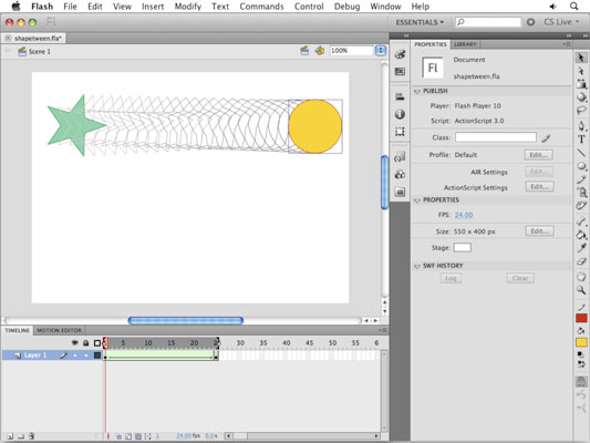
Flash CS5 (shape tween)
Adobe Flash Creative Suite 5 can open up new worlds for creating
quick, sleek animation without much effort. You should take advantage of
shape tweens if your goal is to modify the shape of an object from
start to finish, such as morphing a star into a circle.
For the most part, shape tweens are created in quite a similar manner to motion tweens. However, unlike motion tweens, shape tweens must use raw shapes instead of symbols.
In addition to morphing between distinctively different shapes, shape tweens can morph color. As with motion tweens, you can tween only one shape at a time on a single layer. If you want to create multiple shape tweens simultaneously, isolate each one on its own layer.
Follow these steps to create a shape tween:
- Create a new Flash document. At the bottom of the workspace, click the Timeline panel’s tab to bring it forward.
- On an empty layer, draw a shape (for example, a star or polygon with the Polystar tool) on Frame 1.You can include a stroke and a fill, because the shape tween can handle both.
- Click on Frame 25 and choose Insert→Timeline→Blank Keyframe.Rather than choose the motion tween, we choose a blank keyframe because we don’t want a copy of the shape drawn on Frame 1 to be carried over to the new keyframe.
- Draw a distinctively different shape on the new, blank keyframe on Frame 25.
- Select Frame 1 and choose Insert→Shape Tween.You see an arrow and a green shaded area appear between the starting and ending keyframes, indicating that you’ve successfully created a shape tween.
- Turn on the Onion Skin Outlines option below the Timeline to see the frames that Flash has created for you.
- If necessary, use the sliders that appear on the timeline ruler to show Onion Skin Outlines across the entire range of frames from beginning to end.
- Press Enter or Return to play back your animation.The original shape transforms into the final shape.
Web Design 2
Web Design 2 time to start in javascript and JQuery! The results will be much like those from flash, but without the need for Flash Player!
Please choose a menu to build from the link below:
http://sixrevisions.com/javascript/20-excellent-javascript-navigation-techniques-and-examples/
Please choose a menu to build from the link below:
http://sixrevisions.com/javascript/20-excellent-javascript-navigation-techniques-and-examples/
Thursday, April 5, 2012
Wednesday, April 4, 2012
Web Design 2 Redirect
To create a simple HTML page that will send users/viewers to your home page inside a sub folder do the following:
< meta HTTP-EQUIV="REFRESH" content="0; url=http://www.yourdomain.com/index.html" >
- create an HTML page
- in the HEAD add the following code, but link to your own page - http://scia.shorelineschools.org/username/foldername/pagename.html
- name the page index.html
- place it alone in your root folder on the scia server
< meta HTTP-EQUIV="REFRESH" content="0; url=http://www.yourdomain.com/index.html" >
WIX!!!
Today we will begin making a new site, in prep for an interactive site you will create on your own, using an interactive web template site. www.wix.com
examples:
http://www.wix.com/brandondmills/my-portfolio#!
http://www.wix.com/g3neric_d3rek/flowsnowboards
http://www.wix.com/ameetclicks/treats
http://www.wix.com/rachelelizabethalexa/oncue-website
examples:
http://www.wix.com/brandondmills/my-portfolio#!
http://www.wix.com/g3neric_d3rek/flowsnowboards
http://www.wix.com/ameetclicks/treats
http://www.wix.com/rachelelizabethalexa/oncue-website
Monday, April 2, 2012
Want your site on the web?
Log onto the SCIA server (similar to staff) and drop your site in the "Web_Design_1" folder.
Be sure your site root folder is only named YOUR LAST NAME and that you have one page named home.html or index.html
your site address would then be something like:
http://scia.shorelineschools.org/Web_Design_1/Story/Home.html
Be sure your site root folder is only named YOUR LAST NAME and that you have one page named home.html or index.html
your site address would then be something like:
http://scia.shorelineschools.org/Web_Design_1/Story/Home.html
Site Critique
- Is the PhotoShop Layout professional?
- What could be done to improve this layout?
- Navigation – is it consistent? Functional? Borders set to “0” so there are no gaps in slices/layout? Any way to improve upon current navigation?
- Gallery/Info – does it fit with the layout? Interesting? Areas to improve?
- Overall – what do you like best and least about this site?
Wednesday, March 28, 2012
Photoshop Due Friday
- 3+ .html pages from dreamweaver
- should be aesthetically impressive, professional, and interesting
- image gallery or info on each page
- your images folder
- your pages
- anything else related to your site
- please also include your original .psd photoshop file

If you are complete or near complete, other ideas to fill your time are to:
- add "floating Div's" to put additional information or images into.
- use CSS to add a fun pop up or hoover to an object.
- create an additional page of an image gallery in Bridge or ????
- build a splash or welcome page in Photoshop
Monday, March 26, 2012
Rollover Images

Before you begin, create a second version of your button ("save as"). See above.
You might be inclined to think that this feature is technical and hard to execute. To that, I’d say: you’re somewhat right.

But, still, what about knowing JavaScript? Dreamweaver CS5 can save your life here since–as with many features involving coding–Dreamweaver can simply do it for you!
Create a Rollover Image
To create a rollover image:- In the Insert Panel, go to Insert –> Image Objects –> Rollover Image

- Fill out the “Insert Rollover Image” form

- Image Name – a unique name that is used by JavaScript. Do not use spaces.
- Original Image – the image that will appear when the mouse is NOT hovering
- Rollover Image – the image that will appear when the mouse is over the image
- Preload rollover image – Check this box. It forces the rollover image to be loaded by the browser when the page is loading so that it will be ready when it is needed. Otherwise the browser will have to ask the server for it later and there will be a delay when it is rolled over.
- Alternate Text – Text to appear in a “tool tip” when the mouse is over the image and if the image is not able to load (for example if the user has images turned off or is using a text editor or screen reader for blind users).
- When clicked, Go to URL – This is the link.
Thursday, March 22, 2012
Wednesday, March 21, 2012
Slices! From PhotoShop to Dreamweaver
Part 1: Designing Your Page ‘n Slicin’ it Up
So obviously, the first thing you’ll need to do is create a layout in Photoshop. In my example, I’m building an entire page, and because I don’t want any horizontal scrolling in my layout, I build for the most common monitor resolution, 1024×768. There’s quite a bit of debate as to how wide one can design inside a width of 1024 pixels, but I personally go with 990 pixels as my maximum width. This means that starting off in Photoshop, I create a new file with a canvas size of 990 pixels wide. As for the height, that’s usually determined by content, so you might want to give yourself lots of space to work inside.
Now in the case of creating a page object like a menu or header, you’d have to know the dimensions of the object before creating it in Photoshop.
Once your dimensions are set, it’s simply a matter of building your design. Design and lay out all your buttons, background graphics, logos, and so on, building up your page’s design. Use whatever tools, commands, and options you’d like. Often times, I’ll even cook things up in Illustrator, then drop them into my layered Photoshop layout as Smart Objects, just to make the process go faster.
If you’re building a page as I am here, don’t worry about actual page content—the text and other objects that would appear on the individual pages of your site. Imagine instead that you’re building a template. What you’re after is the overall look of all the pages in your site. Later on in Dreamweaver, you can drop in the content. Once your page design is complete, you’re ready to begin slicing it apart.

Slicing up your design is the fun part. What you’re doing is taking your overall layout and cutting it into smaller pieces. This means you’ll be isolating buttons, logos, and background areas on your page by slicing them away from the rest of the layout. There are a few different ways to slice apart layouts and page components, but I’ll show you my technique.
Here’s how to get started:
1. From Photoshop’s Toolbox, select the Slice tool (under the crop tool).
2. With the Slice tool, click and drag a box all the way around your entire design.
This creates a single, large slice that encompasses your entire layout. I think you’ll find this to be the easiest and most accurate way to slice images.

3. Right-click (or Ctrl+click on the Mac) anywhere inside your design, and choose Divide Slice.
4. In the Divide Slice dialog that appears, decide how you’d like to break that single slice that you just drew. Turn on either Divide Horizontally Into or Divide Vertically Into (or both); then enter in the number of slices you’d like to create. Click OK when you’re ready.
This is where the craft of image slicing comes in. Look for natural breaks in your image. Remember, each slice will wind up being saved out as an individual graphic, so you may want to create slices for each button in a menu, for example. In my layout, I’ve divided the image into three slices horizontally: one for the header area, one for the main area, and a third for the lower, footer area.
If Preview is turned on in the Divide Slice dialog, you’ll be able to see where your slice lines will appear in the image. Don’t worry if they’re not exact, we’ll adjust them in the next step.
5. Next, if needed, adjust the slice lines that appear on your image simply by dragging on them. You may want to zoom in for a little more precision.
You’re now ready to continue slicing apart your layout. I find it easiest to work from the general to the specific—in other words, look for main areas to slice away; then start getting more refined as you go. Once you have the general areas of your layout sliced, you’re ready for the more detailed areas.
6. To continue slicing apart your image, single-click inside a “general area” slice; then right-click (or Ctrl+click on the Mac), and choose Divide Slice once again.
Notice that when you single-clicked inside the slice, all the other slices in the image deselected? Now this time, you’ll only be dividing up the currently selected slice.
7. In the Divide Slice dialog, set the number of slices you’d like to create horizontally and vertically, just you did earlier.
As before, look for natural breaks in your layout. Remember, each slice is saved as a separate graphic, so you might want to isolate buttons, logos, and so on. Don’t get frustrated if you have to start over a few times. Image slicing does takes a bit of patience. Knowing where and what to slice is just a matter of practice.
8. Continue slicing apart your layout using the techniques described until you’re happy with how things are looking.

Things lookin’ good? Great, now you’re ready for the fun part!
Part 2: Savin’ Er Out
Once you’ve sliced up your layout, you’re ready to save everything out of Photoshop. And remember, not only will Photoshop save all your sliced images in one shot (meaning that you don’t have to save each of them individually), but it’s also going to build your page’s underlying code structure for you. So when you save your slices, Photoshop will also save an additional HTML file. That’s the file that you’ll want to open in Dreamweaver. Awesome is an understatement here, folks—it doesn’t get much sweeter than this!
Here’s how to save it all out:
1. Choose File > Save For Web & Devices.
2. In the Save For Web & Devices dialog, set optimization settings for your slices.
If you’ve never used this dialog before, I’ll give you a quick run-through on how it works. Holding down Shift, you can select the slices that you’d like to set certain optimization settings for—that is, compression options when you’re saving an image (or in this case, a group of images) for use on the web. Next, on the right side of the panel, you can set your optimization settings.
Depending on the file format that you choose, different options will appear. For example, in the case of JPG, you’ll see options for compression, quality, blur, matte, and a few others. Unfortunately, we don’t have the space to go through all the options, so you may want to read up on a few of these.

3. Once you’ve optimized your slices, click Save.
4. In the Save Optimized As dialog, name your file in the Save As field; then navigate to the folder where you’d like to save your slices. Don’t click Save just yet.
The location where you save your work will most likely be your site’s local root folder, as you’ve defined it in Dreamweaver (You may need to read up on defining a site in Dreamweaver if you’re not sure what I’m referring to).
5. From the Format menu at the bottom of the dialog, choose HTML And Images.
This ensures that Photoshop will not only save out your slices, but also all the background code needed to render your layout.
If you’d like to explore some of the other options available, choose Other from the Settings menu. You may want to experiment with a few of the commands found here.
6. When you’re ready, click OK.
Photoshop saves out all your slices, and the HTML needed for your layout. Pretty easy stuff. Now lets go take a look at what happened.
7. Minimize Photoshop; then navigate to the folder where you saved your work.
Notice that Photoshop created an HTML file, as well as an images subfolder. Inside the subfolder, you’ll find all the individual slices from your layout.
8. To see your completed layout, open the HTML file in your web browser.
Your layout looks exactly as it did back in Photoshop. Cool!
Part 3: Throwin’ In Some Dreamweaver
Now that everything is saved out of Photoshop, Dreamweaver takes over the formatting duties. In Dreamweaver, try opening the HTML file that Photoshop created, and you’ll see right away that everything’s been created with tables. In Photoshop’s Save Settings (Step 5 in the previous section), you can set whether to use tables or div tags.
Notice too that all the slices sit within the table’s cells. You can drop additional page content on top of your images using a clever technique: Remove the slice from the table cell; then set the cell to the slice’s original dimensions; drop the slice into the cell’s background; and finally insert new text or image content into the cell. This creates the illusion of the content floating above the graphic, as you can see in the screen shot.

Now you can begin making any adjustments you’d like. For example, you could center the layout, add in a background color, create any necessary CSS rules, begin dropping in your content, and set your hyperlinks.
From here, it’s all tweaking—adjusting CSS styles, text, and other page elements within your design. If you want a graphic to appear behind the text in a table cell (which you can see was done in the sample page design, which uses a crater background behind the text), remove a graphic from its table cell and set it as the cell’s background image, just as you did earlier in this chapter. Then insert your text in the cell as you normally would.
As you work, don’t forget to preview your page to see how your design is looking. And here’s one more trick: With your page working well in Dreamweaver and previewing nicely in those target browsers, use it as the basis for the other pages in your site by resaving it under a different file name for each page. Even better, you can use your page as a Dreamweaver template.
So there it is, a quick guide to getting started with image slicing in Photoshop. Experiment and try out some of the different options, and most importantly, have lots of fun!
So obviously, the first thing you’ll need to do is create a layout in Photoshop. In my example, I’m building an entire page, and because I don’t want any horizontal scrolling in my layout, I build for the most common monitor resolution, 1024×768. There’s quite a bit of debate as to how wide one can design inside a width of 1024 pixels, but I personally go with 990 pixels as my maximum width. This means that starting off in Photoshop, I create a new file with a canvas size of 990 pixels wide. As for the height, that’s usually determined by content, so you might want to give yourself lots of space to work inside.
Now in the case of creating a page object like a menu or header, you’d have to know the dimensions of the object before creating it in Photoshop.
Once your dimensions are set, it’s simply a matter of building your design. Design and lay out all your buttons, background graphics, logos, and so on, building up your page’s design. Use whatever tools, commands, and options you’d like. Often times, I’ll even cook things up in Illustrator, then drop them into my layered Photoshop layout as Smart Objects, just to make the process go faster.
If you’re building a page as I am here, don’t worry about actual page content—the text and other objects that would appear on the individual pages of your site. Imagine instead that you’re building a template. What you’re after is the overall look of all the pages in your site. Later on in Dreamweaver, you can drop in the content. Once your page design is complete, you’re ready to begin slicing it apart.
Slicing up your design is the fun part. What you’re doing is taking your overall layout and cutting it into smaller pieces. This means you’ll be isolating buttons, logos, and background areas on your page by slicing them away from the rest of the layout. There are a few different ways to slice apart layouts and page components, but I’ll show you my technique.
Here’s how to get started:
1. From Photoshop’s Toolbox, select the Slice tool (under the crop tool).
2. With the Slice tool, click and drag a box all the way around your entire design.
This creates a single, large slice that encompasses your entire layout. I think you’ll find this to be the easiest and most accurate way to slice images.
3. Right-click (or Ctrl+click on the Mac) anywhere inside your design, and choose Divide Slice.
4. In the Divide Slice dialog that appears, decide how you’d like to break that single slice that you just drew. Turn on either Divide Horizontally Into or Divide Vertically Into (or both); then enter in the number of slices you’d like to create. Click OK when you’re ready.
This is where the craft of image slicing comes in. Look for natural breaks in your image. Remember, each slice will wind up being saved out as an individual graphic, so you may want to create slices for each button in a menu, for example. In my layout, I’ve divided the image into three slices horizontally: one for the header area, one for the main area, and a third for the lower, footer area.
If Preview is turned on in the Divide Slice dialog, you’ll be able to see where your slice lines will appear in the image. Don’t worry if they’re not exact, we’ll adjust them in the next step.
5. Next, if needed, adjust the slice lines that appear on your image simply by dragging on them. You may want to zoom in for a little more precision.
You’re now ready to continue slicing apart your layout. I find it easiest to work from the general to the specific—in other words, look for main areas to slice away; then start getting more refined as you go. Once you have the general areas of your layout sliced, you’re ready for the more detailed areas.
6. To continue slicing apart your image, single-click inside a “general area” slice; then right-click (or Ctrl+click on the Mac), and choose Divide Slice once again.
Notice that when you single-clicked inside the slice, all the other slices in the image deselected? Now this time, you’ll only be dividing up the currently selected slice.
7. In the Divide Slice dialog, set the number of slices you’d like to create horizontally and vertically, just you did earlier.
As before, look for natural breaks in your layout. Remember, each slice is saved as a separate graphic, so you might want to isolate buttons, logos, and so on. Don’t get frustrated if you have to start over a few times. Image slicing does takes a bit of patience. Knowing where and what to slice is just a matter of practice.
8. Continue slicing apart your layout using the techniques described until you’re happy with how things are looking.
Things lookin’ good? Great, now you’re ready for the fun part!
Part 2: Savin’ Er Out
Once you’ve sliced up your layout, you’re ready to save everything out of Photoshop. And remember, not only will Photoshop save all your sliced images in one shot (meaning that you don’t have to save each of them individually), but it’s also going to build your page’s underlying code structure for you. So when you save your slices, Photoshop will also save an additional HTML file. That’s the file that you’ll want to open in Dreamweaver. Awesome is an understatement here, folks—it doesn’t get much sweeter than this!
Here’s how to save it all out:
1. Choose File > Save For Web & Devices.
2. In the Save For Web & Devices dialog, set optimization settings for your slices.
If you’ve never used this dialog before, I’ll give you a quick run-through on how it works. Holding down Shift, you can select the slices that you’d like to set certain optimization settings for—that is, compression options when you’re saving an image (or in this case, a group of images) for use on the web. Next, on the right side of the panel, you can set your optimization settings.
Depending on the file format that you choose, different options will appear. For example, in the case of JPG, you’ll see options for compression, quality, blur, matte, and a few others. Unfortunately, we don’t have the space to go through all the options, so you may want to read up on a few of these.
3. Once you’ve optimized your slices, click Save.
4. In the Save Optimized As dialog, name your file in the Save As field; then navigate to the folder where you’d like to save your slices. Don’t click Save just yet.
The location where you save your work will most likely be your site’s local root folder, as you’ve defined it in Dreamweaver (You may need to read up on defining a site in Dreamweaver if you’re not sure what I’m referring to).
5. From the Format menu at the bottom of the dialog, choose HTML And Images.
This ensures that Photoshop will not only save out your slices, but also all the background code needed to render your layout.
If you’d like to explore some of the other options available, choose Other from the Settings menu. You may want to experiment with a few of the commands found here.
6. When you’re ready, click OK.
Photoshop saves out all your slices, and the HTML needed for your layout. Pretty easy stuff. Now lets go take a look at what happened.
7. Minimize Photoshop; then navigate to the folder where you saved your work.
Notice that Photoshop created an HTML file, as well as an images subfolder. Inside the subfolder, you’ll find all the individual slices from your layout.
8. To see your completed layout, open the HTML file in your web browser.
Your layout looks exactly as it did back in Photoshop. Cool!
Part 3: Throwin’ In Some Dreamweaver
Now that everything is saved out of Photoshop, Dreamweaver takes over the formatting duties. In Dreamweaver, try opening the HTML file that Photoshop created, and you’ll see right away that everything’s been created with tables. In Photoshop’s Save Settings (Step 5 in the previous section), you can set whether to use tables or div tags.
Notice too that all the slices sit within the table’s cells. You can drop additional page content on top of your images using a clever technique: Remove the slice from the table cell; then set the cell to the slice’s original dimensions; drop the slice into the cell’s background; and finally insert new text or image content into the cell. This creates the illusion of the content floating above the graphic, as you can see in the screen shot.
Now you can begin making any adjustments you’d like. For example, you could center the layout, add in a background color, create any necessary CSS rules, begin dropping in your content, and set your hyperlinks.
From here, it’s all tweaking—adjusting CSS styles, text, and other page elements within your design. If you want a graphic to appear behind the text in a table cell (which you can see was done in the sample page design, which uses a crater background behind the text), remove a graphic from its table cell and set it as the cell’s background image, just as you did earlier in this chapter. Then insert your text in the cell as you normally would.
As you work, don’t forget to preview your page to see how your design is looking. And here’s one more trick: With your page working well in Dreamweaver and previewing nicely in those target browsers, use it as the basis for the other pages in your site by resaving it under a different file name for each page. Even better, you can use your page as a Dreamweaver template.
So there it is, a quick guide to getting started with image slicing in Photoshop. Experiment and try out some of the different options, and most importantly, have lots of fun!
Monday, March 19, 2012
Web Design 2
What is a Template?
A template is a common structure of a web site that most of your web pages use. Usually web sites follow a standard structure, for e.g. you would have a header, a navigation bar and a footer that is common to all your pages. Imagine that your site has 25 pages. If you need to make one small change, let's say adding a new link, you would need to go to each of those 25 pages and change it manually. But using a template you only need to change it in the template and all the pages get updated automatically. Here you will learn how to use templates in Dreamweaver.Making a Template in Dreamweaver
Step 1: Make your web page as usual with the basic structure of the site. This should be common to most of the pages in your site. Note: Don't put unique content in this page.Step 2: Once you have created the structure go to File and click on Save As Template, give a name to the template and click on Save.
Step 3: Notice the blue bar on top says <>. You now are in the Template. The template is automatically saved under a folder called templates. Note: You can create as many templates as you like. If you are using different layouts for different sections of your site you can use different templates for each of the sections.
You can continue to make changes, try different layouts, add new stuff etc. in the Template.
Using a Template in Dreamweaver
Once you have successfully made your Template your job is not yet over. You still need to make sure that all the pages are using the Template so that when you update the Template the pages using the Template will automatically get updated. Here are the steps to Apply a template to a page.Step 1: Once you have created a page which will the same structure as the template all you need to do is, Go to Modify/Template/Apply Template to page
Step 2: Once you have applied the specified template to the page you will see a window 'Choose editable region for orphaned content', choose the editable region that you want the content to go into and click on OK. You will see that the template is in yellow and cannot be edited. The only region that is editable is the editable region you have specified in the template.
Note: You can apply the template before writing any content or after it. If you do it after writing content you need to choose an editable region where the content will go.
Organize your layers...
info folders, then make new layers for each "page" of your site (hiding other layers/pages).


Wednesday, March 14, 2012
Photoshop
We have used PS previously to make banners and buttons, now we are going
to use PS to create an entire page, all the way down the the HTML/CSS
that defines out buttons etc.
You will be using the tools in PhotoShop (most often the blending options) to create a complete layout. Please choose from the following 40, find one you like, you can adapt colors/images:
BE SURE YOUR PhotoShop DOCUMENT SIZE IS SET TO 1024×768 @ 72 DPI. This is the most common screen resolution

Create a dark, clean, and usable blog style layout.

Learn how to create an elaborate and decorative design with paper textures.

In this tutorial, you’ll see how to make a clean/grungy layout.

This tutorial goes over how to create a dark-themed, classy web design.
Learn how to create a simple and modern web layout using Photoshop.
In this tutorial, you’ll read a detailed discussion on creating a grungy web design.
You will learn how to create a paper texture and then how to use it in a web design layout.
You’ll be creating a simple web layout that can easily be changed.
Learn the process of creating a versatile web layout that can embody a variety of design themes.
Mix the illustrated look and the popular grunge design trend in this web layout tutorial.
Create a clean and functional "magazine-style" web layout in Photoshop.

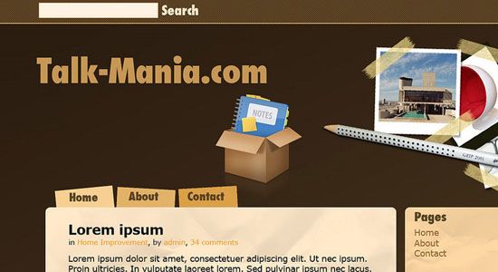
Learn how to create an aged journal web layout.
Create a modern, clean, and usable web layout by following along this tutorial.

Learn how to design an elegant and fancy notebook style web layout.

In this Photoshop tutorial, you’ll learn how to create a grungy-themed web layout.
In this tutorial, you’ll learn how to create a night-themed web layout.

This tutorial goes through a process of designing a professional web layout.

Create a clean, web 2.0 style web layout in this Photoshop tutorial.
This Photoshop tutorial goes over the methods involved in designing a dark-themed web layout.
Create a stylish porfolio by following along this two-part Photoshop tutorial series.

Learn a process for creating a sleek online photo album.

This tutorial will show you how to design a clean business web layout.
In this Photoshop tutorial, you’ll be creating a beautiful dark-themed web layout.
Learn the techniques involved in creating a high-impact blog layout in Photoshop.
In this step-by-step tutorial, you’ll learn how to create a beautiful web layout.

This tutorial goes over the creation of a web layout for car enthusiasts.
Learn how to create a web layout that’s perfect for graphic and web designers.
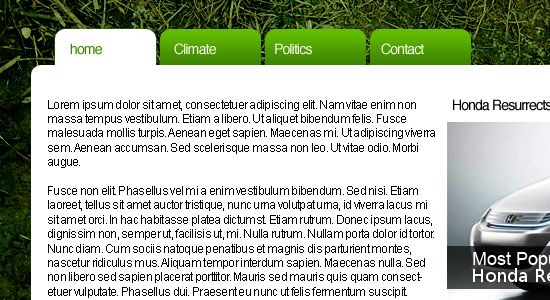
Create a clean and green web layout by following along this Photoshop tutorial.
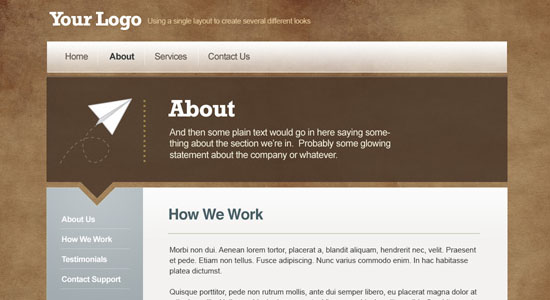
Create this architecture-themed, brown-colored web layout by following along this Photoshop tutorial.

Learn the process of creating this sleek and dark-themed web layout in Photoshop.
In this tutorial, you’ll learn how to create a dark-themed portfolio site.

Create a bright and high-impact web layout by following along this Photoshop tutorial.
Learn how to use carbon fiber textures in your web designs in this Photoshop tutorial.

Learn how to make a dark-themed, clean web layout in this tutorial.

In this Photoshop tutorial, you’ll learn how to make a beautiful portfolio web layout that has a textured background.

This tutorial will show you the techniques involved in creating an eye-catching business themed layout.

Learn how to create a "premium" WordPress web layout from scratch by reading through this Photoshop tutorial.

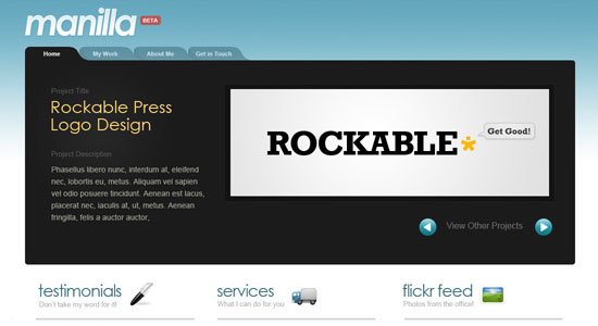
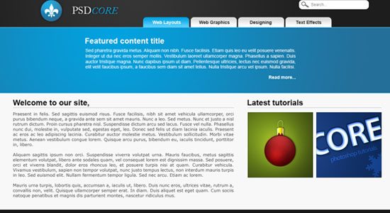
This Photoshop tutorial goes over the techniques involved in creating a clean, blue-themed portfolio site.
This tutorial shows you how to create a website layout that has metallic gradients.
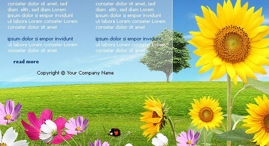
Create a nature-inspired web layout by following along this Photoshop tutorial.
You will be using the tools in PhotoShop (most often the blending options) to create a complete layout. Please choose from the following 40, find one you like, you can adapt colors/images:
BE SURE YOUR PhotoShop DOCUMENT SIZE IS SET TO 1024×768 @ 72 DPI. This is the most common screen resolution
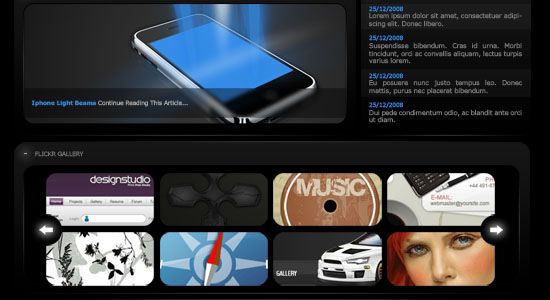
1. Corporate WordPress Style Layout
Create a dark, clean, and usable blog style layout.
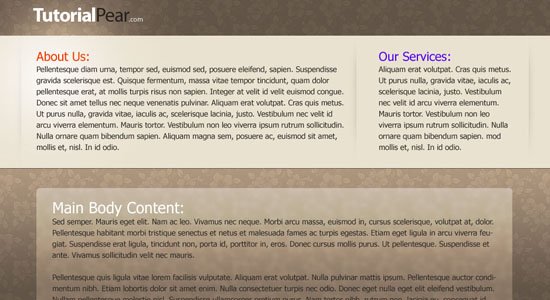
2. Old Paper Layout
Learn how to create an elaborate and decorative design with paper textures.
3. Making the ‘Clean Grunge’ Blog Design
In this tutorial, you’ll see how to make a clean/grungy layout.
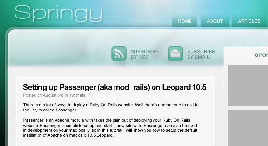
4. Create a Sleek, High-End Web Design
This tutorial goes over how to create a dark-themed, classy web design.
5. Clean Website Layout
Learn how to create a simple and modern web layout using Photoshop.
6. How to Create a Grunge Web Design in Photoshop
In this tutorial, you’ll read a detailed discussion on creating a grungy web design.
7. Photoshop Paper Texture Grunge Design
You will learn how to create a paper texture and then how to use it in a web design layout.
8. How a Simple Layout Can Be Mixed ‘n’ Matched
You’ll be creating a simple web layout that can easily be changed.
9. Five Looks, One Layout
Learn the process of creating a versatile web layout that can embody a variety of design themes.
10. Design a Cartoon Grunge Web site Layout
Mix the illustrated look and the popular grunge design trend in this web layout tutorial.
11. Professional Magazine Web Layout
Create a clean and functional "magazine-style" web layout in Photoshop.
12. Web Design – Journal
Learn how to create an aged journal web layout.
13. Modern Web 2.0 Web Layout
Create a modern, clean, and usable web layout by following along this tutorial.
14. White Notebook Style Web Template
Learn how to design an elegant and fancy notebook style web layout.
15. Design a Unique Grungy Website Layout
In this Photoshop tutorial, you’ll learn how to create a grungy-themed web layout.
16. Simple Night Style Website Layout
In this tutorial, you’ll learn how to create a night-themed web layout.
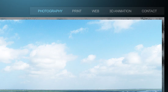
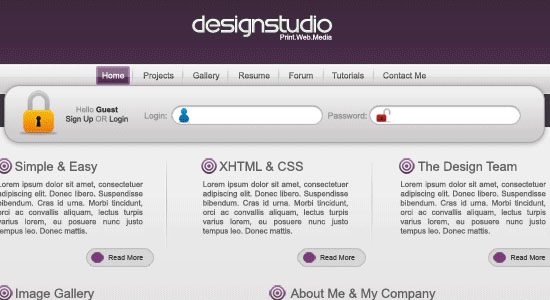
17. Professional Design Studio Web Template
This tutorial goes through a process of designing a professional web layout.
18. Design a Clean Business Layout
Create a clean, web 2.0 style web layout in this Photoshop tutorial.
19. Create a Dark Themed Web Design
This Photoshop tutorial goes over the methods involved in designing a dark-themed web layout.
20. Portfolio Design Part 1 and Portfolio Design Part 2
Create a stylish porfolio by following along this two-part Photoshop tutorial series.
21. Portfolio Gallery Layout
Learn a process for creating a sleek online photo album.
22. Business Layout #3
This tutorial will show you how to design a clean business web layout.
23. Dark Style Web Template
In this Photoshop tutorial, you’ll be creating a beautiful dark-themed web layout.
24. Create a Vibrant Modern Blog Design in Photoshop
Learn the techniques involved in creating a high-impact blog layout in Photoshop.
25. Full Web Template
In this step-by-step tutorial, you’ll learn how to create a beautiful web layout.
26. Car Layout
This tutorial goes over the creation of a web layout for car enthusiasts.
27. Full Photoshop Website Design
Learn how to create a web layout that’s perfect for graphic and web designers.
28. Environmentally Friendly Layout
Create a clean and green web layout by following along this Photoshop tutorial.
29. Architecture layout
Create this architecture-themed, brown-colored web layout by following along this Photoshop tutorial.
30. Design Layout
Learn the process of creating this sleek and dark-themed web layout in Photoshop.
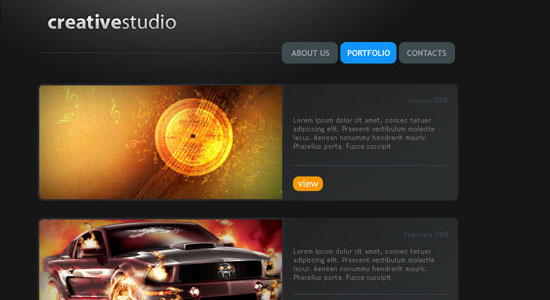
31. Creative Studio Web Page
In this tutorial, you’ll learn how to create a dark-themed portfolio site.
32. Website Design Studio
Create a bright and high-impact web layout by following along this Photoshop tutorial.
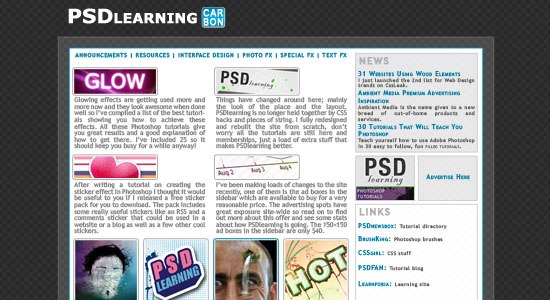
33. Carbon Fiber Layout
Learn how to use carbon fiber textures in your web designs in this Photoshop tutorial.
34. Creating Business Style Template Design
Learn how to make a dark-themed, clean web layout in this tutorial.
35. Model portfolio layout
In this Photoshop tutorial, you’ll learn how to make a beautiful portfolio web layout that has a textured background.
36. Clean Business Layout Tutorial
This tutorial will show you the techniques involved in creating an eye-catching business themed layout.
37. Premium WordPress Photoshop Layout
Learn how to create a "premium" WordPress web layout from scratch by reading through this Photoshop tutorial.
38. Portfolio Layout #9
This Photoshop tutorial goes over the techniques involved in creating a clean, blue-themed portfolio site.
39. Design Studio Layout
This tutorial shows you how to create a website layout that has metallic gradients.
40. Nature Portfolio Layout
Create a nature-inspired web layout by following along this Photoshop tutorial.
Subscribe to:
Posts (Atom)