Search Our Web Design Blog...

Tuesday, December 20, 2011

Hosting your CSS site

  • Log onto the SCIA server (command+K)
  • WebRoot folder
  • Wrb_Design_1 folder
  • drag in your css folder 
the address of your page should be:

http://scia.shorelineschools.org/Web_Design_1/YOUR NAME/Home.html

Monday, December 19, 2011

hoover

.navbar a:hover { background-color: #990000}

Thursday, December 15, 2011

CSS - a new type of code

http://www.w3.org/Style/Examples/011/firstcss

please do not just copy and paste, but add your own info/ideas/aesthetics etc.

be sure to pay attention to which code you are to be adding, css or html... pay close attention when the tutorial has you copy and paste your CSS into a NEW DOCUMENT and then refer to it in your html document, this steps catches a lot of students off guard. make sure you read through the entire tutorial following each step, in sequence. 

You will end up with a pair of documents, both created in text edit.  One will be a .html page and the other will be a .css file.  The css file contains your "style" which is applied to the content of your html pages.

Tuesday, December 13, 2011

WEB DESIGN 2

Time to make a site that will get on the web!  The SC redesign is at a stand still, but the DECA store has asked for a site!  One THEY can update, which means we need to make them a CMS.

A content management system (CMS) is a system providing a collection of procedures used to manage work flow in a collaborative environment. These procedures can be manual or computer-based. The procedures are designed to do the following:
  • Allow for a large number of people to contribute to and share stored data
  • Control access to data, based on user roles (defining which information users or user groups can view, edit, publish, etc.)
  • Aid in easy storage and retrieval of data
  • Control of data validity and compliance
  • Reduce repetitive duplicate input
  • Improve the ease of report writing
  • Improve communication between users
In a CMS, data can be defined as nearly anything: documents, movies, text, pictures, phone numbers, scientific data, and so forth. CMSs are frequently used for storing, controlling, revising, semantically enriching, and publishing documentation. Serving as a central repository, the CMS increases the version level of new updates to an already existing file. Version control is one of the primary advantages of a CMS.

We will be using a very simple CMS script so they can update the menu daily/weekly.

The pages for this site are:

  • welcome
  • about DECA
  • Store (products/menu/hours)

SLICING SITES DUE TODAY!

Please turn in one folder with your site today.  The folder should contain:

  • 4+ .html pages from dreamweaver
  • your images folder
  • please also include your original .psd photoshop file

Tuesday, December 6, 2011

wireframe

If you fail to plan, you plan to fail.  Wire frames are definitely not the most exciting part of designing a Website. However, when implemented as part of your design process, they can prove to be very valuable. It will help you, the designer, focus on the marketing message that you are trying to communicate through the site, produce a more effective site and open up channels of communication with your client. It could also save you a truckload of time.

Thursday, December 1, 2011

Photoshop and Slicing

Part 1: Designing Your Page ‘n Slicin’ it Up
So obviously, the first thing you’ll need to do is create a layout in Photoshop. In my example, I’m building an entire page, and because I don’t want any horizontal scrolling in my layout, I build for the most common monitor resolution, 1024×768. There’s quite a bit of debate as to how wide one can design inside a width of 1024 pixels, but I personally go with 990 pixels as my maximum width. This means that starting off in Photoshop, I create a new file with a canvas size of 990 pixels wide. As for the height, that’s usually determined by content, so you might want to give yourself lots of space to work inside.
Now in the case of creating a page object like a menu or header, you’d have to know the dimensions of the object before creating it in Photoshop.
Once your dimensions are set, it’s simply a matter of building your design. Design and lay out all your buttons, background graphics, logos, and so on, building up your page’s design. Use whatever tools, commands, and options you’d like. Often times, I’ll even cook things up in Illustrator, then drop them into my layered Photoshop layout as Smart Objects, just to make the process go faster.
If you’re building a page as I am here, don’t worry about actual page content—the text and other objects that would appear on the individual pages of your site. Imagine instead that you’re building a template. What you’re after is the overall look of all the pages in your site. Later on in Dreamweaver, you can drop in the content. Once your page design is complete, you’re ready to begin slicing it apart.

Slicing up your design is the fun part. What you’re doing is taking your overall layout and cutting it into smaller pieces. This means you’ll be isolating buttons, logos, and background areas on your page by slicing them away from the rest of the layout. There are a few different ways to slice apart layouts and page components, but I’ll show you my technique.
Here’s how to get started:
1. From Photoshop’s Toolbox, select the Slice tool (under the crop tool).
2. With the Slice tool, click and drag a box all the way around your entire design.
This creates a single, large slice that encompasses your entire layout. I think you’ll find this to be the easiest and most accurate way to slice images.

3. Right-click (or Ctrl+click on the Mac) anywhere inside your design, and choose Divide Slice.
4. In the Divide Slice dialog that appears, decide how you’d like to break that single slice that you just drew. Turn on either Divide Horizontally Into or Divide Vertically Into (or both); then enter in the number of slices you’d like to create. Click OK when you’re ready.
This is where the craft of image slicing comes in. Look for natural breaks in your image. Remember, each slice will wind up being saved out as an individual graphic, so you may want to create slices for each button in a menu, for example. In my layout, I’ve divided the image into 
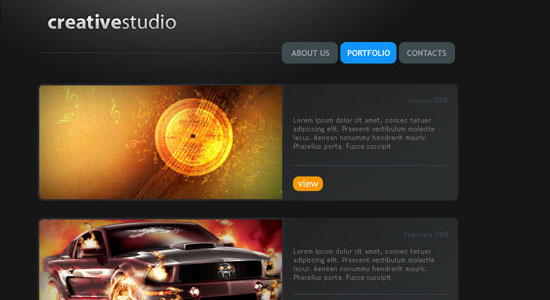
three slices horizontally: one for the header area, one for the main area, and a third for the lower, footer area.
If Preview is turned on in the Divide Slice dialog, you’ll be able to see where your slice lines will appear in the image. Don’t worry if they’re not exact, we’ll adjust them in the next step.
5. Next, if needed, adjust the slice lines that appear on your image simply by dragging on them. You may want to zoom in for a little more precision.
You’re now ready to continue slicing apart your layout. I find it easiest to work from the general to the specific—in other words, look for main areas to slice away; then start getting more refined as you go. Once you have the general areas of your layout sliced, you’re ready for the more detailed areas.
6. To continue slicing apart your image, single-click inside a “general area” slice; then right-click (or Ctrl+click on the Mac), and choose Divide Slice once again.
Notice that when you single-clicked inside the slice, all the other slices in the image deselected? Now this time, you’ll only be dividing up the currently selected slice.
7. In the Divide Slice dialog, set the number of slices you’d like to create horizontally and vertically, just you did earlier.
As before, look for natural breaks in your layout. Remember, each slice is saved as a separate graphic, so you might want to isolate buttons, logos, and so on. Don’t get frustrated if you have to start over a few times. Image slicing does takes a bit of patience. Knowing where and what to slice is just a matter of practice.
8. Continue slicing apart your layout using the techniques described until you’re happy with how things are looking.

Things lookin’ good? Great, now you’re ready for the fun part!
Part 2: Savin’ Er Out
Once you’ve sliced up your layout, you’re ready to save everything out of Photoshop. And remember, not only will Photoshop save all your sliced images in one shot (meaning that you don’t have to save each of them individually), but it’s also going to build your page’s underlying code structure for you. So when you save your slices, Photoshop will also save an additional HTML file. That’s the file that you’ll want to open in Dreamweaver. Awesome is an understatement here, folks—it doesn’t get much sweeter than this!
Here’s how to save it all out:
1. Choose File > Save For Web & Devices.
2. In the Save For Web & Devices dialog, set optimization settings for your slices.
If you’ve never used this dialog before, I’ll give you a quick run-through on how it works. Holding down Shift, you can select the slices that you’d like to set certain optimization settings for—that is, compression options when you’re saving an image (or in this case, a group of images) for use on the web. Next, on the right side of the panel, you can set your optimization settings.
Depending on the file format that you choose, different options will appear. For example, in the case of JPG, you’ll see options for compression, quality, blur, matte, and a few others. Unfortunately, we don’t have the space to go through all the options, so you may want to read up on a few of these.

3. Once you’ve optimized your slices, click Save.
4. In the Save Optimized As dialog, name your file in the Save As field; then navigate to the folder where you’d like to save your slices. Don’t click Save just yet.
The location where you save your work will most likely be your site’s local root folder, as you’ve defined it in Dreamweaver (You may need to read up on defining a site in Dreamweaver if you’re not sure what I’m referring to).
5. From the Format menu at the bottom of the dialog, choose HTML And Images.
This ensures that Photoshop will not only save out your slices, but also all the background code needed to render your layout.
If you’d like to explore some of the other options available, choose Other from the Settings menu. You may want to experiment with a few of the commands found here.
6. When you’re ready, click OK.
Photoshop saves out all your slices, and the HTML needed for your layout. Pretty easy stuff. Now lets go take a look at what happened.
7. Minimize Photoshop; then navigate to the folder where you saved your work.
Notice that Photoshop created an HTML file, as well as an images subfolder. Inside the subfolder, you’ll find all the individual slices from your layout.
8. To see your completed layout, open the HTML file in your web browser.
Your layout looks exactly as it did back in Photoshop. Cool!
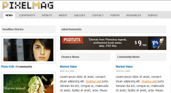
Part 3: Throwin’ In Some Dreamweaver
Now that everything is saved out of Photoshop, Dreamweaver takes over the formatting duties. In Dreamweaver, try opening the HTML file that Photoshop created, and you’ll see right away that everything’s been created with tables. In Photoshop’s Save Settings (Step 5 in the previous section), you can set whether to use tables or div tags.
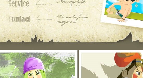
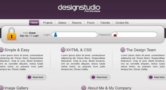
Notice too that all the slices sit within the table’s cells. You can drop additional page content on top of your images using a clever technique: Remove the slice from the table cell; then set the cell to the slice’s original dimensions; drop the slice into the cell’s background; and finally insert new text or image content into the cell. 
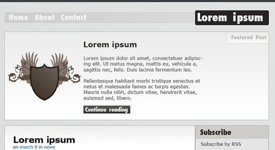
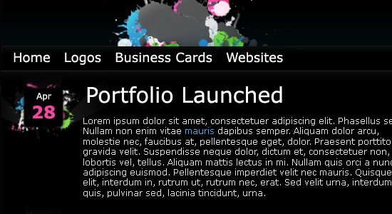
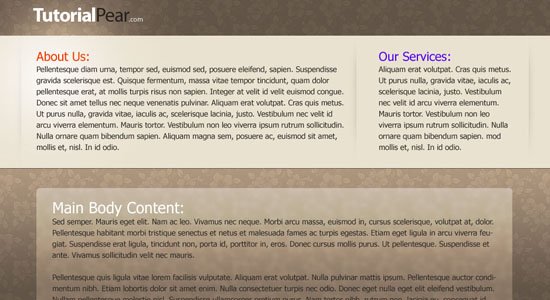
This creates the illusion of the content floating above the graphic, as you can see in the screen shot.

Now you can begin making any adjustments you’d like. For example, you could center the layout, add in a background color, create any necessary CSS rules, begin dropping in your content, and set your hyperlinks.
From here, it’s all tweaking—adjusting CSS styles, text, and other page elements within your design. If you want a graphic to appear behind the text in a table cell (which you can see was done in the sample page design, which uses a crater background behind the text), remove a graphic from its table cell and set it as the cell’s background image, just as you did earlier in this chapter. Then insert your text in the cell as you normally would.
As you work, don’t forget to preview your page to see how your design is looking. And here’s one more trick: With your page working well in Dreamweaver and previewing nicely in those target browsers, use it as the basis for the other pages in your site by resaving it under a different file name for each page. Even better, you can use your page as a Dreamweaver template.
So there it is, a quick guide to getting started with image slicing in Photoshop. Experiment and try out some of the different options, and most importantly, have lots of fun!

Tuesday, November 22, 2011

your first button


01 Photoshop: Create Web 2.0 Button
Create a blank canvas at about 500px (width) x 400px (height) to start off the button design. Create a new layer call ‘bg01‘. Select the Rounded Rectangular Tool, hold SHIFT and draw a round sided square in the center. Any color is fine at the current stage.
02 Photoshop: Create Web 2.0 Button
Call up the Blending Options of ‘bg01‘ and adjust the following styles:
Drop Shadow
  • Opacity: 40%
  • Distance: 0px
  • Spread: 0%
  • Size: 6px
Gradiant Overlay
  • Color stop: 0%, #d00031
  • Color stop: 100%, #ff2b5d
03 Photoshop: Create Web 2.0 Button
Hold APPLE, left click on ‘bg01‘ Layer Thumbnail to select its shape. Go Select -> Modify -> Contract and enter the value2px‘. This will shrink the selected area by 2 pixel.
04 Photoshop: Create Web 2.0 Button
Create a new layer call ‘bg02‘ and filled the highlighted (after shrink) area with any color. I use #000000 black here. Double click on ‘bg02′ to launch up the Blending Option and tweak the following style.
Gradiant Overlay
  • Color stop: 0%, #c6002f
  • Color stop: 100%, #c6002f
Create another new layer for text, call it ‘txt‘. Insert your button’s text. I’ll use an alphabet to represent. The font styles I’m using here are as follow:
  • Rounded Arial Bold
  • 150pt
Same, after deciding your text, double click on ‘txt’ to launch the Blending Options and tweak the following styles.
Drop Shadow
  • Opacity: 25%
  • Distance: 0px
  • Spread: 0px
  • Size: 5px
Inner Shadow
  • Opacity: 10%
  • Distance: 0px
  • Choke: 0
  • Size: 10px
Bevel Emboss
  • Depth: 1px
  • Direction: Down
  • Size: 0px
  • Softten: 0px
  • Highlight Mode Opacity: 32%
  • Shadow Mode Opacity: 32%
Gradiant Overlay
  • Color Stop:0% #d2d2d2
  • Color Stop:100% #f0efef
05 Photoshop: Create Web 2.0 Button
Button is almost done. Let’s give it a little glow over the top part. Hold APPLE, left click ‘bg02‘ Layer Thumbnail to highlight the outer shape; choose Eclipse Marquee Tool. Now hold ALT, with Eclipse Marquee Tool selected, drag is across to minus out bottom half of the highlighted area. Refer to image above.
06 Photoshop: Create Web 2.0 Button
With the top portion highlighted and Eclipse Marquee Tool still selected, right click and choose Feather; enter 15px for the radius.
Create a new layer, call it ‘glow‘ and fill the highlighted part with white [#ffffff]. This should add glow effect to the top part of your button. Final product should look something like the image below.
final Photoshop: Create Web 2.0 Button

Photoshop web layout

We have used PS previously to make banners and buttons, now we are going to use PS to create an entire page, all the way down the the HTML/CSS that defines out buttons etc.

You will be using the tools in PhotoShop (most often the blending options) to create a complete layout.  Please choose from the following 40, find one you like, you can adapt colors/images:


1. Corporate WordPress Style Layout

Corporate WordPress Style Layout - screen shot.

Create a dark, clean, and usable blog style layout.

2. Old Paper Layout

Old Paper Layout - screen shot.
Learn how to create an elaborate and decorative design with paper textures.

3. Making the ‘Clean Grunge’ Blog Design

Making the ‘Clean Grunge’ Blog Design - screen shot.
In this tutorial, you’ll see how to make a clean/grungy layout.

4. Create a Sleek, High-End Web Design

Create a Sleek, High-End Web Design - screen shot./
This tutorial goes over how to create a dark-themed, classy web design.

5. Clean Website Layout

Clean Website Layout - screen shot.
Learn how to create a simple and modern web layout using Photoshop.

6. How to Create a Grunge Web Design in Photoshop

How to Create a Grunge Web Design in Photoshop - screen shot.
In this tutorial, you’ll read a detailed discussion on creating a grungy web design.

7. Photoshop Paper Texture Grunge Design

Photoshop Paper Texture Grunge Design - screen shot.
You will learn how to create a paper texture and then how to use it in a web design layout.

8. How a Simple Layout Can Be Mixed ‘n’ Matched

How a Simple Layout Can Be Mixed 'n' Matched - screen shot.
You’ll be creating a simple web layout that can easily be changed.

9. Five Looks, One Layout

Five Looks, One Layout - screen shot.
Learn the process of creating a versatile web layout that can embody a variety of design themes.

10. Design a Cartoon Grunge Web site Layout

Design a Cartoon Grunge Web site Layout - screen shot.
Mix the illustrated look and the popular grunge design trend in this web layout tutorial.

11. Professional Magazine Web Layout

Professional Magazine Web Layout - screen shot.
Create a clean and functional "magazine-style" web layout in Photoshop.

12. Web Design – Journal

Web Design - Journal - screen shot.
Learn how to create an aged journal web layout.

13. Modern Web 2.0 Web Layout

Modern Web 2.0 Web Layout - screen shot.
Create a modern, clean, and usable web layout by following along this tutorial.

14. White Notebook Style Web Template

White Notebook Style Web Template - screen shot.
Learn how to design an elegant and fancy notebook style web layout.

15. Design a Unique Grungy Website Layout

Design a Unique Grungy Website Layout - screen shot.
In this Photoshop tutorial, you’ll learn how to create a grungy-themed web layout.

16. Simple Night Style Website Layout

Create a Dark Themed Web Design - screen shot.
In this tutorial, you’ll learn how to create a night-themed web layout.

17. Professional Design Studio Web Template

Professional Design Studio Web Template - screen shot.
This tutorial goes through a process of designing a professional web layout.

18. Design a Clean Business Layout

Design a Clean Business Layout - screen shot.
Create a clean, web 2.0 style web layout in this Photoshop tutorial.

19. Create a Dark Themed Web Design

Simple Night Style Website Layout - screen shot.
This Photoshop tutorial goes over the methods involved in designing a dark-themed web layout.

20. Portfolio Design Part 1 and Portfolio Design Part 2

Portfolio Design Part 1 and Portfolio Design Part 2 - screen shot.
Create a stylish porfolio by following along this two-part Photoshop tutorial series.

21. Portfolio Gallery Layout

Portfolio Gallery Layout - screen shot.
Learn a process for creating a sleek online photo album.

22. Business Layout #3

Business Layout #3 - screen shot.
This tutorial will show you how to design a clean business web layout.

23. Dark Style Web Template

Dark Style Web Template - screen shot.
In this Photoshop tutorial, you’ll be creating a beautiful dark-themed web layout.

24. Create a Vibrant Modern Blog Design in Photoshop

Create a Vibrant Modern Blog Design in Photoshop - screen shot.
Learn the techniques involved in creating a high-impact blog layout in Photoshop.

25. Full Web Template

Full Web Template - screen shot.
In this step-by-step tutorial, you’ll learn how to create a beautiful web layout.

26. Car Layout

Car Layout - screen shot.
This tutorial goes over the creation of a web layout for car enthusiasts.

27. Full Photoshop Website Design

Full Photoshop Website Design - screen shot.
Learn how to create a web layout that’s perfect for graphic and web designers.

28. Environmentally Friendly Layout

Environmentally Friendly Layout - screen shot.
Create a clean and green web layout by following along this Photoshop tutorial.

29. Architecture layout

Architecture layout - screen shot.
Create this architecture-themed, brown-colored web layout by following along this Photoshop tutorial.

30. Design Layout

Design Layout - screen shot.
Learn the process of creating this sleek and dark-themed web layout in Photoshop.

31. Creative Studio Web Page

Creative Studio Web Page - screen shot.
In this tutorial, you’ll learn how to create a dark-themed portfolio site.

32. Website Design Studio

Website Design Studio - screen shot.
Create a bright and high-impact web layout by following along this Photoshop tutorial.

33. Carbon Fiber Layout

Website Design Studio - screen shot.
Learn how to use carbon fiber textures in your web designs in this Photoshop tutorial.

34. Creating Business Style Template Design

Creating Business Style Template Design - screen shot.
Learn how to make a dark-themed, clean web layout in this tutorial.

35. Model portfolio layout

Model portfolio layout - screen shot.
In this Photoshop tutorial, you’ll learn how to make a beautiful portfolio web layout that has a textured background.

36. Clean Business Layout Tutorial

Clean Business Layout Tutorial - screen shot.
This tutorial will show you the techniques involved in creating an eye-catching business themed layout.

37. Premium WordPress Photoshop Layout

Premium WordPress Photoshop Layout - screen shot.
Learn how to create a "premium" WordPress web layout from scratch by reading through this Photoshop tutorial.

38. Portfolio Layout #9

Portfolio Layout #9 - screen shot.
This Photoshop tutorial goes over the techniques involved in creating a clean, blue-themed portfolio site.

39. Design Studio Layout

Design Studio Layout - screen shot.
This tutorial shows you how to create a website layout that has metallic gradients.

40. Nature Portfolio Layout

Nature Portfolio Layout - screen shot.
Create a nature-inspired web layout by following along this Photoshop tutorial.